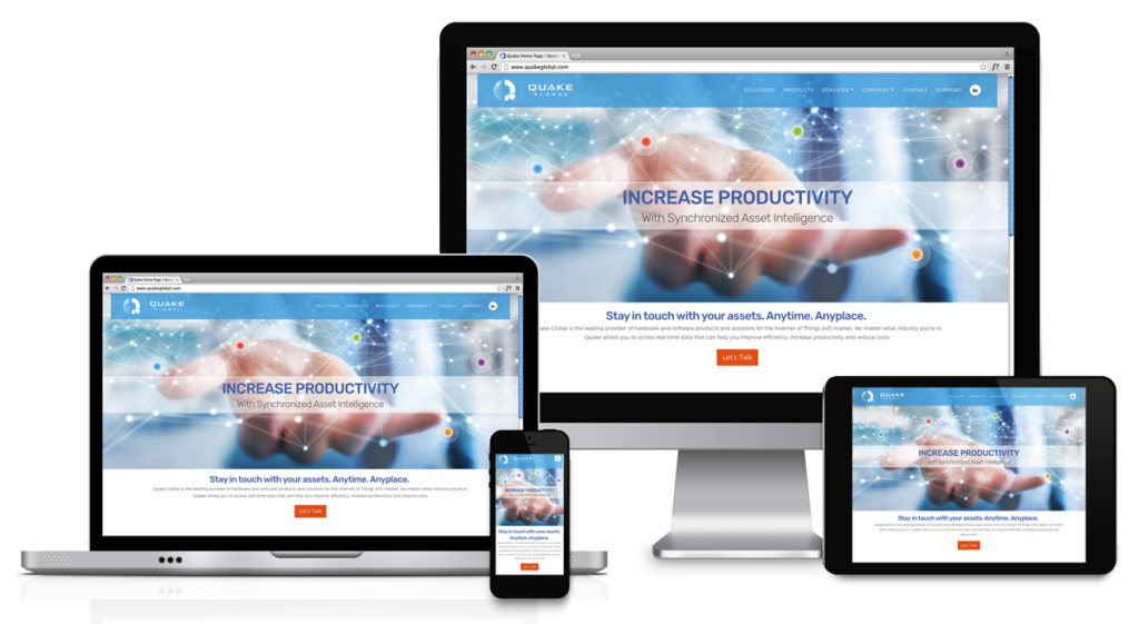
Quake Global, a pioneer in the Internet of Things (IoT) market, chose COE Design to partner with them on their brand refresh, beginning with a new website. For a technology company the functionality of the site lacked call to action (CTA) and tracking potential new customers. COE Design started by pulling together a team of writers, photographers, animators, web developers and a digital marketing company to analyze why the current site was not working. By working collaboratively, the team was able to maximize the development and create a better end product that would solve the client’s needs.
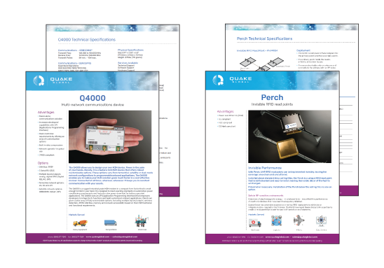
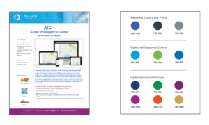
The messaging was key in guiding the brand direction and the first month was spent one-on-one with the client to clarify and finalize the brand message. Once finalized, a brand color palette was created, as well as a logo refresh with new typography for a clean look. COE was able to leverage the brand vision across the digital and print touch-points for a cohesive brand presentation. The overall project included the design for animation, videos, social media and photography for the product sheets and download materials.
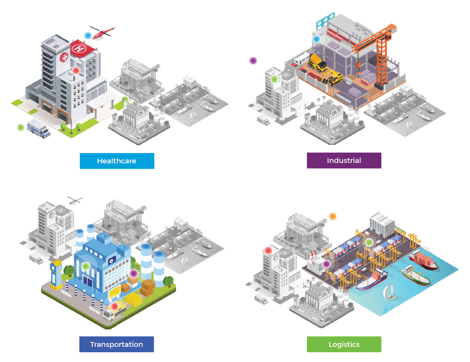
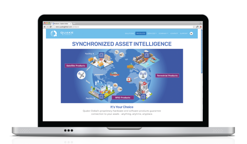
As part of the Quake Global story, COE Design also created a series of animations; one for the intro to introduce the Quake logo as a worldwide supplier, another that would highlight and explain the RFID and Satellite product offerings, and a final animation showing the various industries served. Laura Coe Wright and her team pulled from original and stock illustrations to tell these stories. The refresh of the corporate palette and brand which began with the website and product collateral, will continue into the new Quake corporate offices as they continue the transformation with a recent move.