Many projects come with a limited budget. We have learned over the years various ways to maximize this dilemma without sacrificing the end results. For example, a one-color job is not a crisis. A short digital run does not mean limited paper choices. And a tight turn around date may still allow handwork concepts be presented.
Here is one COE Design project where we feel we have stretched the dollar to reflect a bigger budget.
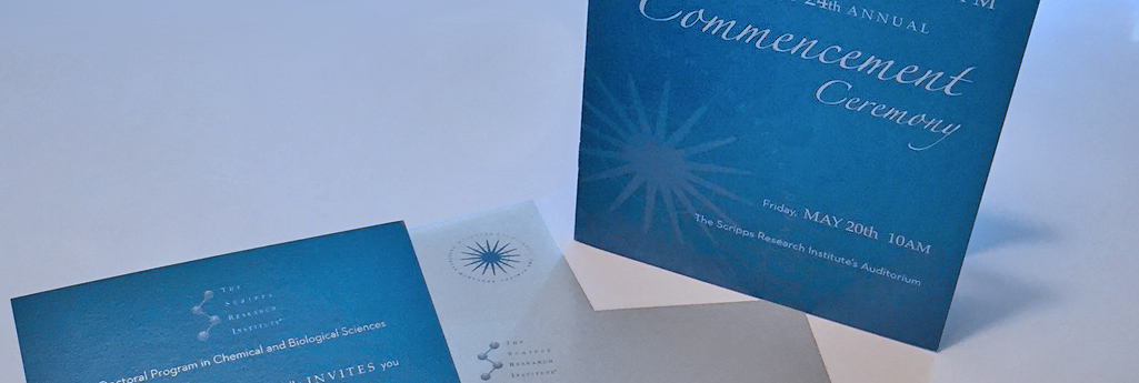
Scripps Research Institute turned to COE Design for a redesign of their existing materials for their Annual Commencement invitation, table tents and collateral. They were looking for something special to set TSRI apart. We felt we could achieve this economically and still give the graduates the same edge of distinction they exhibit in their research work.
COE Design’s solution was to start with a stylized yet elegant font and create a typographic solution that would complement their existing logo and brand. Using screens of the logo, and while keeping paper and color in mind, we presented designs that allowed the typography to present the message. Pulling metallic paper solutions that were available for a digital press, we solidified our presentation with a design that gave our client exactly the look she wanted.
Our client was very excited to see how special her ‘two color’ project appeared. And the bonus, unlike the previous years, it was a 4 color run. We chose to keep the monotone look of the corporate colors for brand consistency, using a variety of screens and reverses to achieve ‘complex’ simplicity. Yes, an oxymoron, but to achieve the simple look on a digital press the layering, testing and prepress of this effect was actually very detailed.
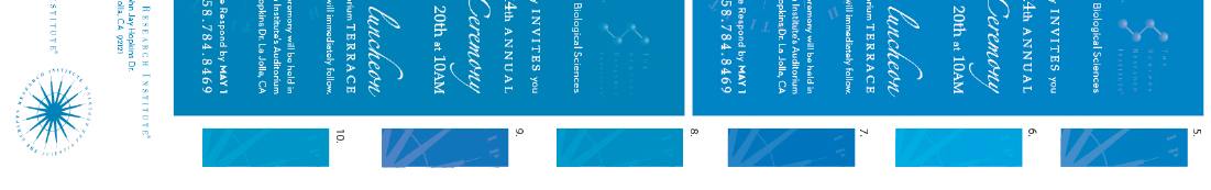
After extensive research on digital paper stocks that worked with their primary brand color, a shimmery silver paper gave it the elegance we were hoping to achieve. Stardream Silver cover was chosen as the best solution, but required a few tests to make sure readability did not suffer. The printing solution was a critical component as the uncoated metallic stock inks can absorb ink and greatly shift the tone, print quality and color. COE Design managed this challenge by requesting multiple print tests using various shades and tints of ink and various metallic papers. This stock was used for the program cover, invitations, variable table tents and envelopes.
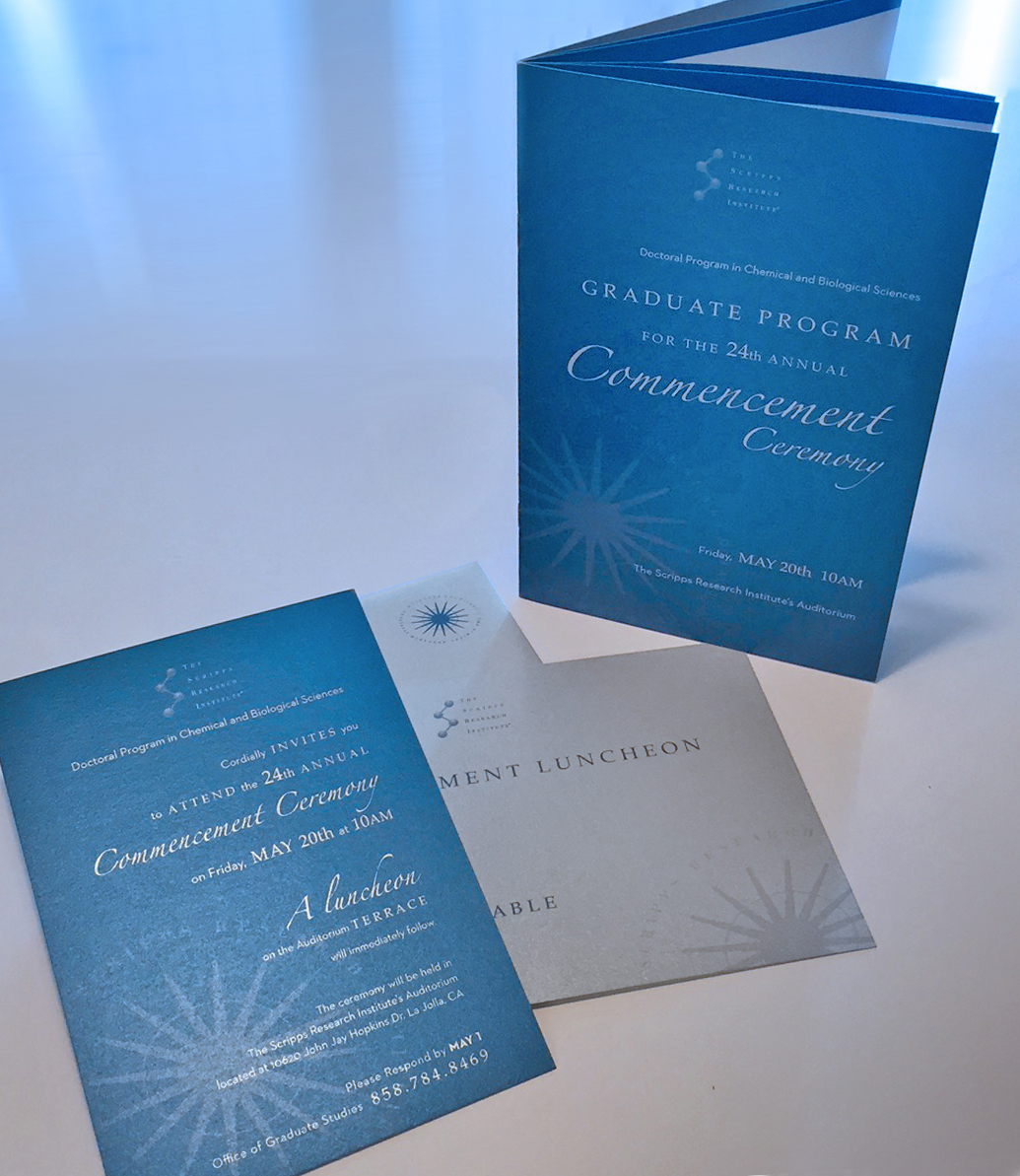
The results were beautifully executed, presenting a high-end solution that gave a feeling of elegance for this special event. The client was elated and felt the materials delivered went above and beyond her expectations.
We were effective in elevating the look and successful in making their 2016 graduation materials memorable.